Text: Margaret Zainey Roux
Photos: Andrew Kung
For Isabel Ladd, “practice what you preach” is more than just an old adage. It’s a sentiment that she takes to heart, and it’s evident in all that she does.
“I’m a girl of many mantras,” says the Brazilian-born, Kentucky-raised interior designer. “Among them is ‘banish the beige.’ I thrive on creating homes that are saturated in a kaleidoscope of colors and layers of prints.”
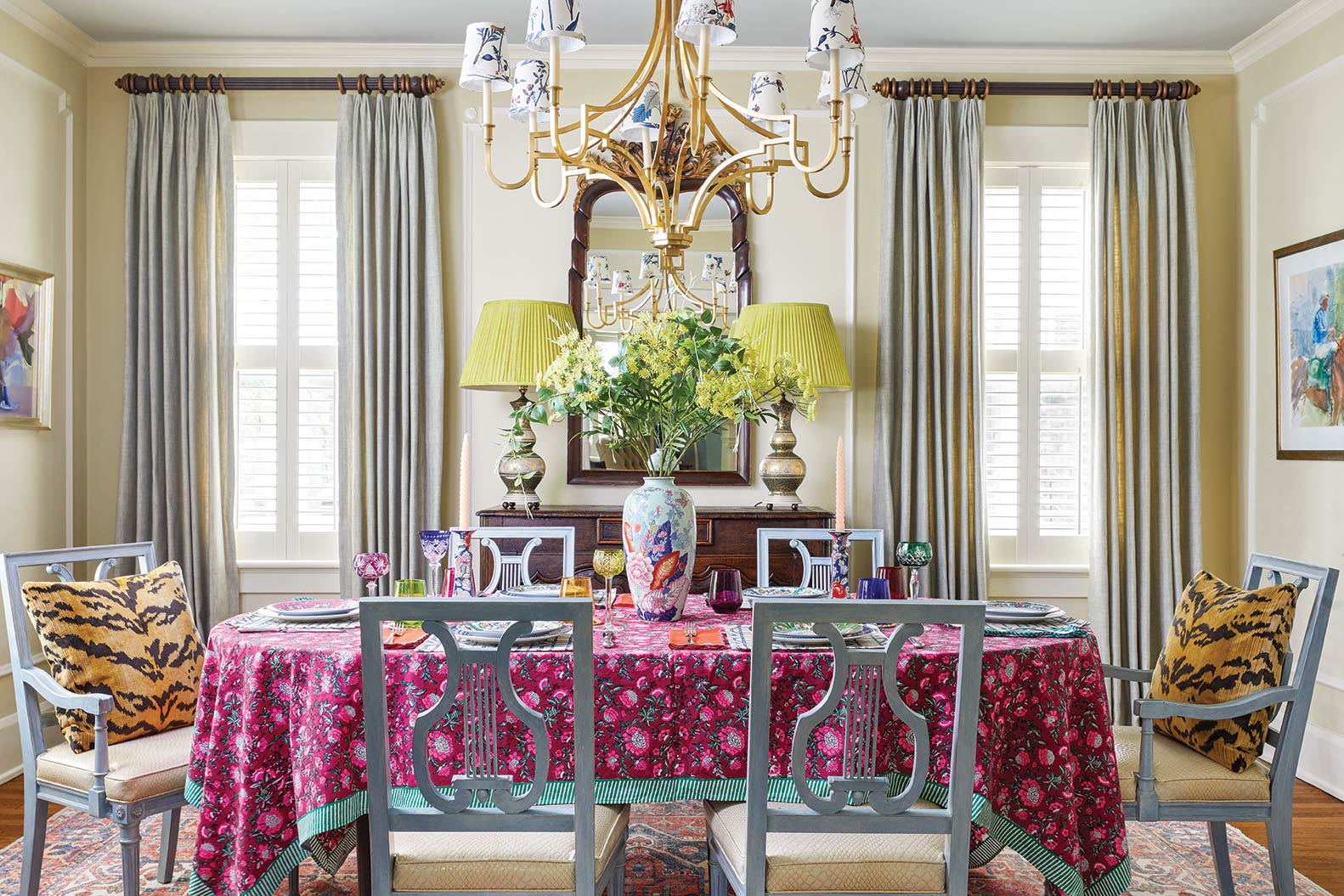
4. Lexington Designer Isabel Ladd Mixes Maximalism and Tradition in a Colorful Family Home

3. Lexington Designer Isabel Ladd Mixes Maximalism and Tradition in a Colorful Family Home

2. Lexington Designer Isabel Ladd Mixes Maximalism and Tradition in a Colorful Family Home

1. Lexington Designer Isabel Ladd Mixes Maximalism and Tradition in a Colorful Family Home

Ladd attributes her passion for punchy hues and bold patterns to her background in fashion. After graduating from the Fashion Institute of Design and Merchandising in Los Angeles, she made a name for herself working at hip fashion houses, including Trina Turk, Ed Hardy, and BCBG. But, over time, the bright lights of the big city began to dim, and she found herself longing to be back home and looking for new ways to color the world.
Having extensive experience with textile design, Ladd began exploring the world of interiors and quickly discovered that her passion for prints was not limited to couture fabrics but extended to upholstery and drapery fabrics, rugs, and wallcoverings, which mixed effortlessly in her own home and in the homes of the neighbors and friends who enlisted her help. Lexington residents Christa and John Marrillia also took notice, and when they decided to refresh their young family’s home, they entrusted Ladd with the project.
“The Marrillias’ home and personal style definitely leans toward traditional, but they were intrigued and excited by the idea of more opulent interiors, as long as it wasn’t too over the top,” says Ladd. “It took a little convincing, but they trusted me when I told them that I could tailor my own maximalist aesthetic to suit their classic style in a way that felt natural and authentic for both of us.”
In addition to selecting all the hard finishes and furnishings for the newly added family room, bar, screened porch, and terrace, Ladd invigorated some of the existing spaces, such as the kitchen and powder room, that felt tired and unfinished. At the start of the process, the homeowners revealed that blue was not only their favorite color, but it is the one color that best captures their aesthetic because it is crisp, classic, and tranquil.
With this in mind, Ladd used a wide range of blues in varying textures, finishes, and applications throughout the design. From the softest shades of powder blue and cornflower to the most brilliant hues of sapphire and turquoise to the richest navy and steel tones, blue wraps rooms in visual interest and keeps the eye roving from each well-appointed room to the next.
“My clients’ love language is blue, and I respect that!” says Ladd. “But we could use 100 different shades of it, and the house would still fall flat. I reminded them that opposites attract and reinforced that we needed just a few jolts of something else for some sass and juxtaposition.”
Pops of chartreuse and pinches of red, pink, and coral are threaded throughout the window treatments, upholstery, accessories, and art as well an unexpected burst of orange in the bourbon bar. Intentionally, it’s only used once for impact.
While “non-blues” are sparse, patterns are plentiful. In the living room alone, there are seven that complement one another. Large- and small-scale mix; timeless and modern mingle; and casual and chic marry to give birth to a layered and luxurious design.
“I am a maximalist, so to me, there is no such thing as too much of a good thing,” says Ladd. “Unless, of course, all those good things match.”


