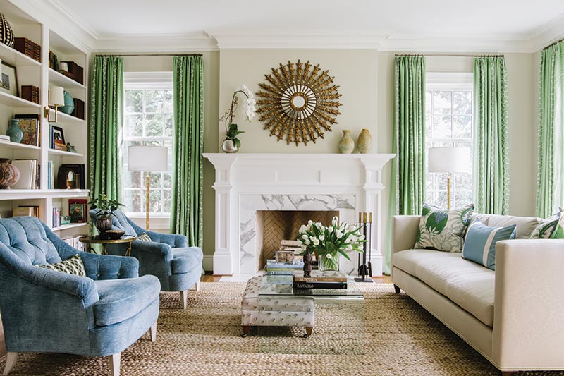
Directly across the hall in the living room, the blue of the dining room’s wallpaper is loosely picked up in a Christopher Farr fabric. “It has great color and pattern,” says Schuler. “But because the homeowners have such lovely things in that room, we decided to use the fabric on a throw pillow so that the pattern wouldn’t be overwhelming.” From that pillow, the designer pulled blue for the tufted velvet armchairs and green for the linen curtains with cream linear-trellis embroidery.
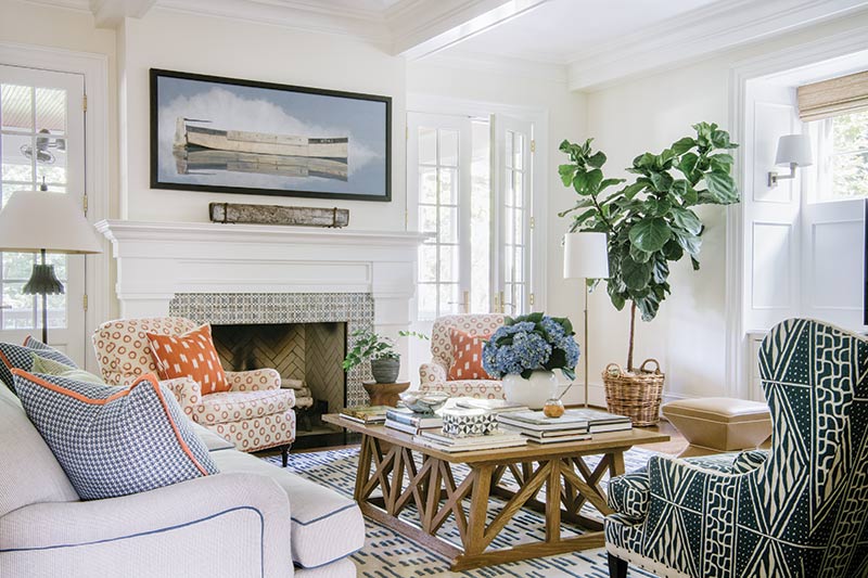
At the back of the home, the palette turns a tad bolder. The family room’s carpet, with its bright blue linear markings, came first, followed by coral-orange and marine-blue tones via piping, pillows, and upholstery. On the porch just beyond, sunny yellow makes its happy appearance. “I wanted to bring in new colors so that the palette wasn’t exactly the same in each room,” says Schuler. “The key is finding that balance that keeps the palette from being either jarring or boring.”
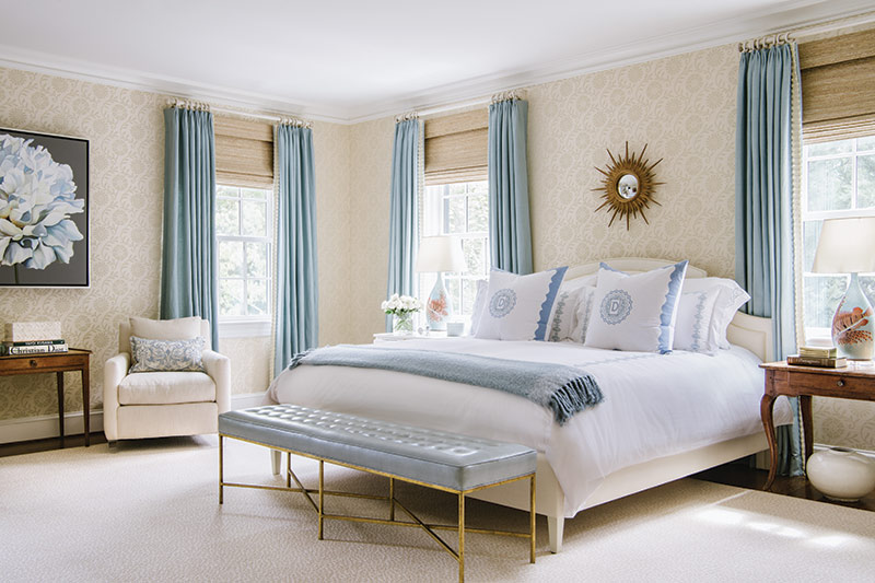
A powdery blue brings a sense of serenity to the master bedroom. Schuler added in textures and subtle patterns with a grass cloth medallion-printed wallpaper and a leopard-print wool carpet. “It’s all about paying attention to the details,” says Schuler, who also interjected bits of black throughout the home. “Black adds gravitas to the lighter colors.”
“It was such fun working with these clients,” says Schuler. “They share my love of detail, proportion, and color.” And those common interests, paired with a designer/client relationship that has spanned the years, resulted in the perfect formula for creating a dream house.
Shop the issue below for more colorful inspiration for your interiors!


